Saturday, November 30, 2013

Ribbons and Buckles!

Here's a SUPER SIMPLE Triple-Loop Bow with Buckle Center accent...  another pretty embellishment for cards from Christina! Adding an embellishment of ribbons with a buckle to your design can take it from plain to pretty in a few easy steps.


Watch video on YouTube: HERE


As always, she's shows a beautiful card with the created embellishment on it. This could easily be changed to just a double-loop or even a single-loop bow as well.... :)

*** NOTE - Make sure you pick a buckle (ribbon slide) that's suitable for your theme AND a ribbon that not only coordinates, but that will pass through the buckle and lay flat across it's center bar.


Wednesday, November 20, 2013

Ruffled Ribbon and Rose

NO SEWING NEEDED!

That's right.... make beautiful ruffled ribbon and rose embellishments for your cards without sewing a stitch! I can't believe how easy this is! 


Watch this great video: HERE


Doesn't Christina make it look so easy to do? I just LOVE this! The satin rose she makes is gorgeous. I'm ready to try them with the other kinds of ribbon.... just have to get more of that super tacky tape! 


Tuesday, November 12, 2013

COLORING CLASS - Yellows

Here's a new Coloring Class from Christina, using the Spectrum Noir alcohol ink pens in the YELLOW color group (this would apply as well, to any alcohol ink pens like Copics, CTMH, etc).

She colors a couple of cute chubby birds, and shows how to shape round bodies from a flat image! 


Watch on YouTube: HERE


I'm glad I watched this tutorial video and had that rounding kind of 'shaping' brought to my attention, or I may never have figured out how to make their tummies look just right! There are a lot of images that this technique would need to be used on for achieving that curved shape..... some other animals, a round pot or vase, balloons, etc. 

I'll continue to add more of these coloring classes as Christina makes the videos.... so stay tuned! 

Thanks for stopping by :)


Sunday, November 3, 2013

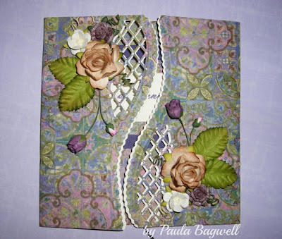
Fancy Anniversary Card


I wanted to share an anniversary card I made for my best friend and her hubby. I really do like how it turned out! It is totally a 'case' card... 
I saw the original one here.   

You can click on the photos to see
them larger for more detail.
front view

I ran the die through my Cuttlebug to cut both the card base and the patterned paper separately. Then I slightly offset the patterned paper to show the CTMH Colonial White cardstock below. Not only can you see the scalloped edge of the cardstock, but you can also see it behind the lattice work. I also popped the patterned paper up slightly to create more definition between the layers, and finished it off with floral arrangements and some Liquid Pearls at the lattice intersections! 


open view
I made the inside very simple, but it does match! I covered the inside with the same patterned paper. For the sentiment, I layered the patterned paper on a dark purple cardstock mat, and then attached the sentiment on top to make it stand out. 


Here are a couple of close-up views:
close-up of top left

close-up of bottom right

The flowers and leaves are all from I Am Roses. I hand-painted the small "open" dark purple roses (not the buds) with magical mica's from Lindy's Stamp Gang.... LOVE that stuff!!.... The roses were white before I painted them. You can see how they sparkle when looking at the full-size image 
(click on photo), but the photos don't even do them justice. They are more 'sparkly' in person! 


view to show the dimension of the paper layers... 
see how the patterned paper is raised up slightly
above the Colonial White cardstock?

I used a bunch, and I mean a whole bunch, of tiny, 1/16" thick pop-up squares between the paper layers for just a little dimension. I didn't want to raise it up too much. You can see just the first row of them down the right flap edge in the photo above. Each front panel has them all around the edges, as well as holding up the centers of each panel. It required so many of them to stabilize the lattice area, since none could be put between the layers there without showing.


One final look... I hope you liked this card, too!
Thanks for stopping by today :)


Supplies:

Paper - Hot Off the Press
Cardstock - Bazzill and CTMH
Die - Joy Craft
Flowers/Leaves - I Am Roses
Liquid Pearls
Lindy's Stamp Gang Magical Mica's
Scor-Tape
Other: MS Word; hot glue; dimensional pop-up squares


Sunday, October 27, 2013

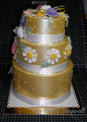
Wedding Cake Box for an Anniversary!


Well, I can't believe it, but I made another one..... the 


Wedding Cake Gift Card Holder Box!!

Only this time it was for an Anniversary... for our son and DIL. You can click on the photos to see the larger image. I have the instructions for one of these in the blog post of my first cake box... you can find it here. So I'm not going to print out all the instructions again! I'll try to point out the different things I did on this one, and any new instructions needed. 

Front View

On this cake, I covered the layers with CTMH cardstock in Sunkiss Yellow, but I did not emboss any of the "cake" layers. I decided to apply the cardstock with strong double-sided tape, instead of the wet glue I used on the first cake. I ended up having to use wet glue to get the ends to stay put anyway, so I recommend using a wet glue for entirely covering the boxes, as it gave me a much better permanent bond. 

And this time I tinted the pearl paint with the CTMH Sunkiss Yellow reinker before painting the layers, to keep the color from turning a lighter yellow. 

Left Side

Also the white satin ribbon is the real deal here, not paper 'ribbons'! I had to put the ribbon on in two layers, as the yellow pearl paint bled through the first ribbon layer where I had applied the glue. (Oh no!) But the top ribbon layer covered those spots very nicely! Whew... avoided disaster!

I did not use glitter to cover the hot-glue seams between the layers like I had done before. This time I went over them with Liquid Pearls in White Opal.

Back View

Instead of the 'spikey' flowers on the first cake, I chose daisies, as this is her favorite flower, and what their real wedding cake had all over it. 

I made each daisy by punching 2 flower layers and then snipping a "v" shape from the end of each petal (very time consuming, lol). I slightly rotated the 2 layers to offset the petals just a little bit. The center of each is actually a button... yes, buttons.... BUT they are covered with a 2-tone mix of Flower Soft that I blended myself. I love how they turned out with their fuzzy centers! 

I chose to arrange them not only throughout the cascade, but around the middle cake layer. That's why no embossing was needed on the middle layer, like I did on the first cake. And I used the Bitty Pearls on the top and bottom layers.


Right Side

The carnations and 'itty-bitty' flowers are made just like before... just color changes, with darker inked edges.... Amethyst CS with Gypsy inked edges and Blush CS with Cotton Candy inked edges on the carnations, and the 'itty-bitty's' and small carnations are done in White Daisy CS with Sunkiss Yellow inked edges. Some of the carnations are plain white and some of the 'itty-bitty's' are also sprayed with Glitz Spritz in Sunset Pink before adding the Liquid Pearl centers.

The leaves are different...... instead of hand cutting and inking them, I just purchased these pretty 2-toned ones from I Am Roses. I think they match the overall cake very well. 


Top

The pearl hat pin is again holding the center flower on, and it with it's leaves, are covering the gift card and slot in the top of the box. The skinny yellow ribbon is attached to the gift card for easy removal and then the center flower can be replaced! 

I mounted the cake on white with punched border, then on gold mirricard, and finally the chipboard base to stabilize the whole project.

OK... I think I have covered it all.... so I hope y'all like this box as well as the first one!


Supplies:
CTMH: Cardstock - Amethyst, Blush, Sunkiss Yellow and White Daisy; Inks - Cotton Candy, Gypsy and Sunkiss Yellow; Reinker - Sunkiss Yellow; Pearl Paint; Bitty Pearls
Lindy's Stamp Gang: Glitz Spritz - Sunset Pink
I Am Roses: 2-toned leaves
Liquid Pearls - White Opal
Flower Soft and Flower Soft Glue
Marco's Paper: Mirricard
Other items: Assorted punches; foam brush; X-acto knife; paper mache nesting boxes; Scor-Tape; hot glue; glue dots; chipboard; pearl hat pin; white and yellow satin ribbons; buttons; brads


Saturday, October 19, 2013

Anniversary Card for the Hubby


Today is our 33rd Anniversary!

I just wanted to share the card I made for my hubby.

Front View
I kept it very simple and masculine.
Just some embossing, distressing
and a simple sentiment
held on with eyelets and baker's twine!

This is a close-up of the distressing techniques...
I used a block sander to gently
sand off some of the outer green color
to expose the white core center of the
cardstock, after I had embossed it
AND I scraped the edges of the
green layer with my scissors.
So simple!

Inside of card

I can't take credit for the inside idea,
but I did do the math, LOL!

I saw this idea on Pinterest probably over
 a year ago, and thought I had pinned
it to one of my boards. I searched
for quite some time trying to find it
to give proper credit, but for the life of
me, I could not locate it.

I have over 125 boards on Pinterest
with almost 26,000 'pins'.... and
I looked on every board I thought I 
could possibly have pinned it to, but to no avail.
So, I either overlooked it or I didn't
pin it to begin with, so whoever I got 
this from.... thank you for the inspiration!


Supplies used:
Fiskars - Country Colors Cardstock - Kraft (for card base)
Close To My Heart (CTMH) - Colonial White & Garden Green Cardstock;                                                                    Chocolate Ink Pad 
Cuttlebug - Embossing Folder Leafy Branch
Stampin' Up! Word Window Punch - elongated... see how here.
MS Word - 8 different fonts for sentiments
Kraft Outlet - (online) Brown Baker's Twine
Scor-Tape
Extras: antique copper eyelets from my stash, sanding block and scissors,
             Cuttlebug Machine


Thursday, October 17, 2013

Meet Benjamin!

Even though it is technically October 17, I haven't been to bed yet, so for me it is still October 16, 2013, so I'm posting this really on Wednesday :) 

And what a special day it has been! Our second grandchild was born today! Meet Benjamin:


This is our son's first child, and what an excited and proud poppa he is! Momma is doing great, as well. :)

Benjamin was born at 8:11 AM. He weighed in at 8lbs 6ozs and is 20.5" long.... a hefty and handsome young man! I can't get over how small he looks compared to his Daddy's hand on his belly, but then again, our son is anything but a small man.... or even an average one, LOL!..... He's a big and brawny man at 6'7" tall and 300+ lbs! Although starting out, he was only 3ozs heavier than Benjamin and exactly the same length, so I think Benjamin just may follow in his Daddy's footsteps!

My hubby is over the moon at having a Grandson.... you know, that typical "guy" thing, with our only son having a boy, to carry on the family name and all. I'll never really understand that "need", and that's probably because I'm not a guy, so what does it matter?!!! Our granddaughter already has Grandpa wrapped around her little finger, just as her momma still does, LOL!!... Anyway....

Congratulations to our son and daughter-in-law on their new bundle of joy! :)


Saturday, October 12, 2013

Random-Stamped Card with Burlap!


I was going to sit down to make my hubby an anniversary card, when I got side-tracked by a pile of papers on my desk! I ran across 4 sheets of text weight paper with matching envelopes, in varying colors of Kraft, which I had gotten from Kraft Outlet

I had no intention of ever using them as stationery, since all but one was too dark, in my opinion, for writing anything! So I decided to use the paper on cards instead. I've only completed 2 of the 4 cards, but I'm only going to share one of them here..... the first one turned out horrible less than I expected, LOL! Card finished size is 4" x 8.5":


click on photo to see it larger

I used the lightest paper here, called Buff Ivory. I random-stamped the front using the first and second generation stamping technique. I just used first generation on the corner of the envelope and at the bottom of the inside panel of the card. 

Below, you can see the inside of card.... (I don't know why the buff ivory paper looks so white in this photo. I took it right after the photo above... just moved the envelope and opened the card. Everything else was the same!)


I mounted the stamped papers on a brown cardstock base. Then I added the burlap and other embellishments to decorate, but left it blank... without sentiment. I can use this card for a number of different occasions, so I'll add the sentiment when I'm ready to use it :)


ITEMS USED:
Buff ivory paper and envelope; brown Baker's twine - KraftOutlet.com
Crocheted ribbon; Burlap ribbon; Sunset ink pad - CTMH
Stamp Set - Baroque Motifs - Stampin' Up!
Card base - Brown cardstock "Country Colors" - Fiskars
Scor-Tape
flower and button from my stash


Thanks for stopping by! :)
Paula


Monday, September 9, 2013

Beautiful and Modern Wedding Invitations

Awhile back, I got my sister stuck on paper crafting.... cards, scrapbook layouts, etc. Her only child just got married, and she wanted to make their wedding invitations for them, so her DIL-to-be described what she wanted, and I showed her how to go about making them. 

This is what we came up with:


Derek wanted a red & black wedding, not because of the elegance of those two colors, but because he is a huge Texas Tech fan, LOL!

Sandea, on the other hand, loves purple and zebra print!! But because she loves my nephew, too, she compromised her purple for a red, black and white wedding, so her zebra print fit right in, and Derek still had his beloved Texas Tech color scheme! Besides.... her dress was white, so everything came together just fine. (They even special ordered zebra-print converse shoes with red laces for the footwear! Strange to me, but totally normal to them!)

The writing was done in Word and printed on 24lb white paper. My sister was so excited to find zebra envelopes online (from Hobby Lobby). The red cardstock came pre-cut from LCI Paper (www.lcipaper.com). The little red sparkles are actually flat stickers called "Jewel Dazzles" from Paper Wishes, also online.  I know the zebra ribbon was an online purchase as well, but I just can't remember where we ordered it from :( 

We think they turned out pretty well. She made them all by herself, after my initial help with the design, and for a relative newbie in paper crafting, I think she did a wonderful job on them. :) 


Sunday, September 1, 2013

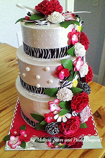
Bridal Shower - WEDDING CAKE Gift Card Box

Wedding Cake Gift Card Box
made with paper!


Next weekend, our one and only nephew is getting married! Early in July,
his mom and I gave the happy couple a bridal shower/dinner at my house. We hand-crafted some paper decorations to hang above the hearth, where the gifts were, as well as over the bistro table, where the delicious cupcake tree sat! 


You can see the whole and half-circle rosettes hanging down. We had attached them to the light fixture that hangs over the bistro table.

Alongside the cupcakes, my sister placed her wedding cake gift card holder box! After seeing the one I had made my friend, Susi (see my original cake box here, along with the 'how to' instructions), she was just waiting until her only child got married to make one for them! 

Of course she used their color theme of red, white and black (in this case zebra and red!) If you click on the photo to make it larger, you'll see the "zebra" print center on the rosettes that I had to hand-draw! You'll also see the zebra cupcake holders around the outside of each cupcake!

Now here are some close-ups of her wedding cake gift card box.... so sorry, in advance that a couple are blurred.... 


front view

side view

top view

front view

The bride-to-be loved the wedding cake box! That's what mattered most :) .... hope you like it, too!


Thanks for stopping by.... come again :) 


Side Note: Something is apparently wrong with my camera, since ALL the photos looked perfectly clear on the screen, and it wasn't until I loaded them in to the computer that I found out how bad they were. I couldn't even salvage the 'front view' close-up while the cake box was on the bistro table. I'm glad my sis had taken a picture of it while still in the scraproom, or I wouldn't have had any clear ones! Of the 60 photos taken at the party, we only kept 23 and most of them have some blurring as well... so disappointed :(  


Thursday, August 22, 2013

WARNING !!.... Adorable Child on the Loose... Proceed with CAUTION

I thought it was about time to bore you with more photos of our adorable baby granddaughter before our second grandchild arrives in October

The following photos were taken in a awesome photo shoot session to capture her at a year old. (photos were taken by Mary Pam Sizemore)

First up.... her being adorable, even with a runny nose (allergies). 
She's getting ready for her first outdoor bath in the warm summer sun...

She apparently didn't like the flowers
floating in her bathtub!


I absolutely love this adorable bonnet :)


Now for the more formal set....

Can't get over those baby blues!

This one is our favorite, and it captures
her two new top teeth as well!


And finally... the very casual ones... 

 Discovering nature!

 In a 1967 Corvette Fastback


 Thanks for letting me take a few moments to 
share our pride and joy with you. 


Saturday, August 17, 2013

Zebra Wedding Card

My only nephew is getting married next month. My sister had a bridal shower for the happy couple here in my home last month. Here is the Bridal Shower/ Wedding card I made for them.


I embossed the red cardstock with a zebra print Cuttlebug embossing folder before cutting into the banner strips. Then I outlined the indented lines with a silver glitter gel pen to make them stand out a little more. I added a black velvet glittered ribbon and red velvet hearts to the front. 

I forgot to take a photo of the matching inside, but it had one red zebra patterned strip laying horizontally toward the bottom with the velvet ribbon going down the middle of it, stopping just short enough for a red velvet heart to fit at the end of it, but still on the red banner piece. If you look closely at the left side inside corner, you can see a bit of it in the photo. Next time I'll try to remember to get that "inside" photo!

Thanks for stopping by my blog... I hope you'll come again :) 


Saturday, July 13, 2013

COLORING CLASS - How to Blend Colors

In this Coloring Class, Christina shows us several ways to blend colors on to your background papers using blender blocks with pads or felt. She uses both Distress Inks and Alcohol Inks for these ideas.


Watch on YouTube: HERE


Some of these ideas are for multi-color shading around your colored images. Other ideas are for making gorgeous background papers. Christina uses a variety of papers here, including cardstock, acetate, and mirricard. 

Well, this was the final Coloring Class for this series. 
I may be posting more classes in the future, which I will just add with the same 'tag/label', so that all tutorials about coloring will be together under the "Tutorials - COLORING CLASS" label in my sidebar.

I hope this was beneficial to some of you... I know I learned a few things along the way!

Thanks for stopping in and following these coloring tutorials. :)  


Thursday, July 11, 2013

COLORING CLASS - Reds

In this Coloring Class, Christina covers the red alcohol ink pens.

Reds can cause problems when coloring because of the vibrancy of the color, so she starts with the lightest color all over each section to wet the paper first. That way, blending the darker colors in will be easier.


Watch on YouTube: HERE


She finishes with making a beautiful decoupaged card.

Well this coloring series is finally coming to a close! The next video will be the last of this series. It covers how to BLEND Distress and Alcohol Inks on different papers for that added touch to your cards.

Hope you'll join me then. Have a great day!

Tuesday, July 9, 2013

COLORING CLASS - Greens

In this Coloring Class, Christina shows how to
color a GREEN Dragon!
BUT this would also be how to color frogs, reptiles, etc.
AND leaves and foliage! 


She also shows a little bit on how she does 
her cloudy sky background with Distress Ink and template. 


Watch on YouTube: HERE


She finishes with putting her card together.


In the next COLORING CLASS, we'll be going over the
REDS!


Sunday, July 7, 2013

COLORING CLASS - Creating a Cloudy Sky

Since Christina mentioned coloring a cloudy sky in her last video tutorial, I wanted to show a way to do it. I found a video using Copic markers.... but the same technique can be applied to the Spectrum Noir pens. 


Watch on YouTube: HERE
(This video is by Annika Ryan. The music is a little too loud in
some places, but they get it straightened out)

You'll just have to experiment with the Spectrum Noir colors to figure out which ones to use for the shading, but I'd start with the very lightest blue - TB1 - to color the spaces around the clouds. 

The next Coloring Class will will show how to work with just the Greens...
for coloring a Dragon..... or it could also be good for coloring frogs!


Friday, July 5, 2013

COLORING CLASS: ...Browns for Animal Fur

Animal Fur can be a bit tricky, so Christina shows how to do this by coloring a momma monkey and her baby. Since both monkeys are "brown", each section of their bodies are colored in the same way. So once you understand how their bodies are colored, then you can skip ahead to about 10 minutes into the video.....


Watch on YouTube: HERE


At that time, she starts talking about the background. Then she goes into how to texture the monkey's fur.... don't miss that part! A cool technique and it's very easy to do!

Finally, she covers how to make it into a card, by making matching patterned paper to use for the card front.


(Next Color Class will have a video from Annika Ryan,
showing us how to create a Cloudy Sky background!)


Wednesday, July 3, 2013

COLORING CLASS: ...Ice Greys

In this first 'class' for coloring with the different color sets of the Spectrum Noir alcohol ink pens, Christina, from Card Making Magic, uses the Ice Greys to color a winter snow scene.

These "shadowing" tips really make the scene come alive instead of being just a flat image on the page. See how she does it in the following video:


Watch on YouTube: HERE

I love how great these colors look for shading things that need to stay looking white! And of course, she finishes off with showing how it looks made into a beautiful card.

These tips and techniques would be the same with any brand of alcohol markers, including Copics, CTMH, and other similar pens. Watching Christina actually coloring and blending these images, gives me much more confidence that I can master coloring with alcohol ink pens, too!

Next up is a tutorial on coloring and texturing animal fur, in the video COLORING CLASS - Browns! Don't miss it!


Monday, July 1, 2013

COLORING CLASS: ...Jeans

Create the everyday outfit of blue jeans and t-shirts on your images, especially on cards or projects for teenagers or when needing something for the masculine gender.

In Christina's video tutorial, she shows how to do this... even gives the jeans a little "washed-out" faded look. 


Watch on YouTube: HERE


I just love the way she shades things that are supposed to be white, so they aren't just flat on the page!.... Speaking of that, in the next Color Class, she will be covering the Ice Grey's pen set. She makes a beautiful snow scene come alive with her shadowing techniques.... don't miss it! 


Saturday, June 29, 2013

COLORING CLASS: ...Darker Skin Tones and Curly Hair

Christina from Card Making Magic, shows how to color darker skin tones in this 2-part video tutorial. It's done almost exactly the same way as the pale skin tones, just using different colors, plus a final all-over blending to eliminate any blotches.

In the first video, she also covers the technique to coloring CURLY HAIR. And in the second video, both a baby boy and a baby girl card are finished up so we can see the final projects!


Watch Part 1 on YouTube: HERE

Watch Part 2 on YouTube: HERE


I hope you are getting the hang of coloring with alcohol markers/pens. In the next video post on July 1st, Christina covers how to color blue JEANS! Hope you'll come back to see it :)  


Thursday, June 27, 2013

COLORING CLASS: ...Backgrounds

Create stunning marbled backgrounds to compliment your images using the same color of alcohol pens you've used on your image! Or use some complimentary colors to the cardstock you will use if the image is mainly white, like for the blue/green card in the video.


Watch on YouTube: HERE


Christina, from Card Making Magic, shows how to do this in the video tutorial..... You just need some acetate, blending solution for alcohol inks, and a few cotton balls. (And you can add stamped images with Stazon ink if you'd like, but it's not necessary)

I love this technique. The backgrounds are so beautiful. What wonderful additions to those handmade cards.

The next tutorial, in 2 days, will cover coloring DARKER SKIN TONES and CURLY HAIR... see you then!  


Tuesday, June 25, 2013

COLORING CLASS: ...Clothes

There are 2 video tutorials from Christina covering this section on how to color 
CLOTHES! 

The first one covers creating folds and shadows in clothes, even on a plain white dress! Then how to turn a white image into a polka-dotted fabric or a solid colored fabric.


Watch Part 1 on YouTube: HERE


The second has some more tips on how to alter the fabrics - making stripes and dots (or any other design you'd like) - using the Blender Pen. Also learn how to "ground" the image, so it's not just 'floating' in mid-air!


Watch Part 2 on YouTube: HERE


I hope these videos are helping some of you, as much as they've helped me!


Please be sure to come back in 2 days for the BACKGROUNDS! 
We are getting close to finishing off this particular card, but after we do, there will still be several more coloring videos to come!


Sunday, June 23, 2013

COLORING CLASS: ...STRAIGHT HAIR

We are now up to the video on coloring STRAIGHT HAIR with alcohol ink pens!

In this video tutorial, Christina shows us how to color and create lovely effects in the straight hair of our chosen character images..... with just a few simple strokes! 


Watch on YouTube: HERE


Doesn't get much easier than that!


She includes how to color CURLY HAIR in her 2-part video tutorial on coloring darker skin tones, which I'll post later this month... so be watching for that post in a few days!

Meanwhile... see you in 2 days for how to color CLOTHES!

Friday, June 21, 2013

COLORING CLASS: ...Pale Skin Tones

In this second video of this series, Christina from Card Making Magic, starts teaching some coloring techniques. She is beginning with images that have pale skin tones.


Watch on YouTube: HERE


I'm so glad I found these videos and saved them in these blog posts. Before watching this series on coloring techniques, I was so intimidated by coloring with alcohol pens. Christina's way of teaching is not only calming, but her technique really makes me think that ANYONE, including me, can learn to color images for creating beautiful cards, etc. She really shows just how simple coloring these images can be. Thanks Christina!

Stay tuned for the next coloring video in 2 days, covering how to color STRAIGHT HAIR!


Wednesday, June 19, 2013

COLORING CLASS: ...Spectrum Noir Alcohol Pens - Introduction


This is the first video in a series introducing Spectrum Noir alcohol pens..... and this will start off the section of tutorials for coloring with these alcohol pens called... COLORING CLASS!

*** NOTE: In this video, Christina even covers what paper and inks to use for stamping/coloring images, and how to print off digital images so that the images won't 'bleed' when using any brand of alcohol pens, YAY!!!


Watch on YouTube: HERE


Over this series, Christina, from Card Making Magic, will show how to color images - including skin, hair, & clothes. Also how to create backgrounds, adapt ribbon & embellishments to match color schemes, and finally put together the complete card made from all the parts done in the previous videos. 

The Spectrum Noir Colouring System was introduced by Crafters Companion in 2011. These are alcohol pens that blend together to create beautiful effects on your colored images. They are also refillable! And they are much less expensive than Copics, too!

(I'm sure these techniques would be the same for any alcohol pens, like Copics, ProMarkers, or Close To My Heart.)

I hope you enjoy this coloring with alcohol pens series. I will be posting a new video every 2 days until we get through the entire COLORING CLASS series! The next one will cover how to color PALE SKIN TONES. I hope you will join me on this journey. 


Wednesday, June 12, 2013

Card Making - Just the Basics - Tying Bows

In this final segment for this section of Card Making - Just the Basics.... at least final for now --- I reserve the right to add to this series later, if needed, lol!.... the topic I'm posting today is on tying bows for embellishing your cards.

Christina, from Card Making Magic, teaches a very easy way to make bows..... skinny and wide bows... one, two, and three layered bows.... scruffy, twirled and vintage bows! Lots of great and easy ideas in this video tutorial:


Watch on YouTube: HERE


Now in the next tutorial section, we'll cover coloring your images... either stamped or digital. These tutorials will be covered in the section called "COLORING CLASS".... (Christina uses the Spectrum Noir Alcohol Pens in her coloring video segments, but the same rules apply to any alcohol pens, including Copics.)

I hope you'll stay tuned for these informative COLORING CLASS videos. They will begin on June 19th! Have a great day!


Monday, June 10, 2013

Card Making - Just the Basics - Creating Card Stands

In this video tutorial, Christina, from Card Making Magic, shows how to make card stands for displaying the beautiful card creations that you give to others. Each version will fold flat for fitting into the envelope/box with the card.

The stands are created in several different ways.... both attached to the card and as separate stands. Watch how easy this is to do:


Watch on YouTube: HERE


Saturday, June 8, 2013

Card Making - Just the Basics - Adding Texture

Adding texture in the background of your cards results in a wonderful effect.... and can be done in different ways.

You can create striped lines by just using a score board and scoring tool. Or even use metal embossing plates with a design to dry hand-emboss. But the most popular these days is to use embossing folders and a die-cutting machine. There are so many designs out there on the market for embossing folders, that you're sure to find some to your liking.

In this video tutorial, see how the pretty embossed background makes such a statement, rather than if the paper was just left plain. 

As an added bonus, Christina shows how to make a card stand to display the large card. (A separate video on making different card stands will follow this post in a couple days.)


Watch on YouTube: HERE


*** NOTE: When purchasing embossing folders, you can choose  from other companies than from just the same brand as your die-cutting machine.... just be sure that the size of the folder will fit through it. I have a Cuttlebug with both the regular plates and the extended length plates, so it will fit any folder that is not more than 6" wide!


Related Posts Plugin for WordPress, Blogger...