Showing posts with label Masculine. Show all posts

Sunday, October 20, 2019

Loads of Love

For my hubby...


It was for our anniversary yesterday, so he's seen it now! 

Love this cute little old truck image from Beccy's Place ... 
a digital stamp set "The Long Haul". 

I'm also entering it in her October Challenge on her 

Thanks for stopping by.


Saturday, August 12, 2017

Don't Laugh!

I decided that for my very first shaker card, I would make my hubby one for our anniversary.....

This is what I used to make the shaker part... Spellbinders Hexagon dies to make a frame, but not in white..... I used gray, and a sentiment created in MS Word...... (remember the sentiment!)...


When I had it all cut out, I colored the hearts on the letters NUTS in red, ink distressed the frame edges, and added the dimensional tape, I of course had to lay it flat to fill with the shaker elements before attaching the clear acetate and frame top. This is what it looked like lying flat:


I wasn't sure I had filled it enough with Pretty Pink Posh's silver heart sequins, their clear and silver cupped sequins, and the red and clear seed beads plus tiny silver beads from my stash, but I went with it...... I wanted it to look nice when the card was standing up, when everything would fall to the bottom, so I glued a few of the elements in place. Then I stood it up!! 

Well it turns out I had PLENTY.... even MORE THAN ENOUGH.... 

Here's the  Don't Laugh! part of this post..... 
My "I'm still nuts about you" sentiment turned into:

(click on photos to view larger images)

Yep, that's right!.... "I'm Still NUTS"!!!.... I had wanted it to be the perfect shaker card for my wonderful husband of more than 30 years!... I almost cried before my sense of humor returned. It was too late anyway to turn back, as everything was glued to card front, and I was NOT starting over. So he ended up with a flawed shaker card, but that's OK, because he has a flawed wife!


As you can see, the "nuts" are the masculine equivalent of  'nuts & bolts'. I made them by first punching holes along a strip of cardstock, spaced apart enough to punch a hexagon around them (Stampin' Up punch). I inked distressed them all with black, as I had the center shaker nut, and popped up a couple for dimension.

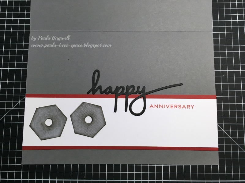
Next is the inside.... I made it to match the front of course, but I used a stamp & die set from Papertrey Ink called One Big Happy... 'happy' is die cut and 'anniversary' is stamped.


I put another 'nut' on the envelope. For some reason the envelope looks like it was bent in 1/2 at some point, but I assure you that it was not... it was flat!


I also shook the contents up on an angle for this pic, but no matter which way I got them to go, I could NOT uncover the entire sentiment all at the same time...

Lesson learned... don't fill shaker so full, LOL!!


Thanks for stopping.... and more thanks to those of you who didn't laugh :)


Thursday, June 2, 2016

Masculine Wetlands - Ocean OR Lake Scene??

This sponged beach scene is not my original idea, but I've seen so many of these type of cards using the Wetlands stamp set, that I don't know who to give credit to! :)

(click on photos to view larger images)

I started by masking off the top and bottom of front panel with hand-torn scrap papers. I started sponging the inks from each torn edge toward the center, where they blended together just a little. Then I masked off a straight edge just above all the 'sand' color to make a water horizon line, using the same lighter blue in several layers. I then sponged in the darker blue at the top. With the bottom mask in place, I stamped the tall grasses, before removing the mask to stamp the sentiment. Last of all. I stamped the birds stomping around in the shallows! Then I attached the card front to a green pearlescent card base.

I was going for an ocean meets sky horizon, but with the much darker blue and the way I tore my top mask, it looks more like a misty lake with mountains off in the distance! I like how it turned out.  


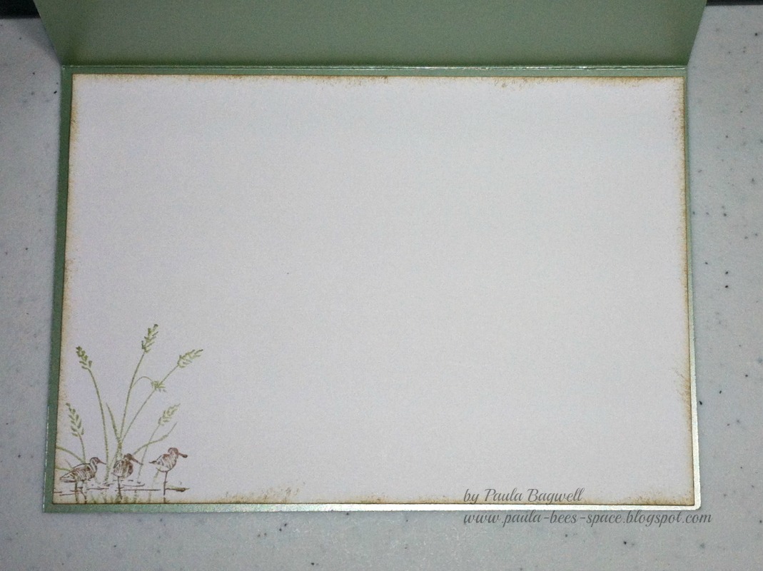
On the inside, I stamped-off twice (3rd generation) for the lighter image, inked around the edges and left the rest blank for a personal note.


Supplies:
Stamp set - Stampin' Up! Wetlands
Ink - CTMH Crystal Blue, Desert Sand, Olive, Outdoor Denim, Black
CTMH card stock - White Daisy
ScorTape
sponges


What do you think? Ocean with sky or lake with mountains?


Friday, July 24, 2015

MASCULINE Sympathy Cards


As promised, here are the 2 masculine sympathy cards I made for friends of mine. (see the feminine card here)... One death in their family affected several lives.... 

These two cards were for 2 men whose relationship are uncle & nephew.... one lost his sister... the mother to the other  :(

I used the same card base and patterned papers (list at bottom), but changed them slightly. I cut 1-1/2" squares and rounded the opposite corners of each. Then I had to decide on the arrangements on each card.


For the first card, I tried the design above... but it looked too much like a flower to me, so I played around with the pieces. I finally chose the option below and just added the extra rounded squares and sentiment below it.


For the second card, I decided I wanted a little dimension, so I added smaller matching pieces on top of 2 sections (a little hard to see in photo below, since they're not popped up yet).... but again this shape looked too girly (flower) to me. 


So more playing around with the paper pieces until I was happy!... Added a couple more 1" rounded squares to the mix and came up with this:


With a 90 degree turn, another set mirroring it below, popped up the small rounded layers and the sentiment... finally happy... and Done!


List of supplies:
5x7 card bases with matching envelopes - purchased at Hobby Lobby
CTMH Passages patterned papers (retired)
CTMH Cocoa and Bamboo card stock
Scor Tape and pop dots
sentiment done in MS Word


Saturday, November 22, 2014

Masculine Anniversary Card


This is the card I made my hubby for our anniversary. It's quite large.... the Kraft cardstock base is a full 
8.5" x 11" piece, folded in half.... so finished size is 
5.5" wide x 8.5" tall.

I created the poster-type front in MS Word, using 12 different fonts. And I picked all different colors for both the backgrounds and fonts in each section.... making for a quite colorful card!

When I finally had it all arranged the way I wanted, I printed it out on white cardstock and cut it out, leaving a small white border all around as a faux mat.

Hope you like it.... my hubby did! :)

Thanks for stopping by.


Saturday, October 19, 2013

Anniversary Card for the Hubby


Today is our 33rd Anniversary!

I just wanted to share the card I made for my hubby.

Front View
I kept it very simple and masculine.
Just some embossing, distressing
and a simple sentiment
held on with eyelets and baker's twine!

This is a close-up of the distressing techniques...
I used a block sander to gently
sand off some of the outer green color
to expose the white core center of the
cardstock, after I had embossed it
AND I scraped the edges of the
green layer with my scissors.
So simple!

Inside of card

I can't take credit for the inside idea,
but I did do the math, LOL!

I saw this idea on Pinterest probably over
 a year ago, and thought I had pinned
it to one of my boards. I searched
for quite some time trying to find it
to give proper credit, but for the life of
me, I could not locate it.

I have over 125 boards on Pinterest
with almost 26,000 'pins'.... and
I looked on every board I thought I 
could possibly have pinned it to, but to no avail.
So, I either overlooked it or I didn't
pin it to begin with, so whoever I got 
this from.... thank you for the inspiration!


Supplies used:
Fiskars - Country Colors Cardstock - Kraft (for card base)
Close To My Heart (CTMH) - Colonial White & Garden Green Cardstock;                                                                    Chocolate Ink Pad 
Cuttlebug - Embossing Folder Leafy Branch
Stampin' Up! Word Window Punch - elongated... see how here.
MS Word - 8 different fonts for sentiments
Kraft Outlet - (online) Brown Baker's Twine
Scor-Tape
Extras: antique copper eyelets from my stash, sanding block and scissors,
             Cuttlebug Machine


Friday, November 2, 2012

Train Lover vs. Bookworm

My best friend, Carol, is a bookworm... can that woman read!!!... vs....
Her husband, Tom.... he loves trains!!

My dilemma .... what to do for an anniversary gift and card? I had to give this some thought, especially since for the last several years, no, for all of them (LOL!) I've made mostly "girly" cards. So I had to finally take Tom into consideration as well (sigh!) After all, it is his anniversary, too!

What to do, what to do?.... I had already decided that I wanted to give Carol a gift card to Barnes & Noble (she likes to go in there and just smell the new books before shopping... sniff, sniff!... I guess sort of how my hubby likes to go into Wilson's and just smell the leather! LOL!). And if our area had a train museum or something, I would have gotten Tom a gift card to go there, but, alas, nothing of the sort in the area :(

.... the closest thing to anything transportation here is Cadillac Ranch, and that's FREE! Although, we do have trains running through town. I hear their whistles all the time. But I couldn't just send Tom out to the tracks to watch trains, even with good advice 'not to play on the tracks', could I?
So what's a girl to do?

THIS:


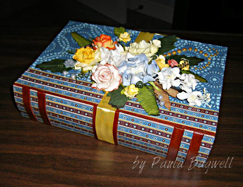
I decided to cover a paper mache "BOOK" box for Carol
and do the matching card with Tom in mind.


I've had this CTMH Sweet Home paper for some time now (it's retired). When I saw the paper mache book, I knew I had to cover it in this paper, because for some reason, the striped B&T patterned paper reminded me of story books my Grandmother had when we were growing up. Each book had 3 or 4 stories in them, and those stripes just brought back good memories for me :)

I attached the paper to the box with Mod Podge for Paper, letting each section dry thoroughly before moving on. It was pretty time-consuming to get all the pieces just right, because I had to line up the front cover's side binding with the back side (I'm OCD that way!!) and I went up and over all the edges with the papers. It probably would have been a whole lot easier
to just put the paper to the edges, and color the edges with matching markers!!!

When the paper was done, I covered the entire outside of the box, in stages, with a layer of the Paper Mod Podge... I like it better than the regular, because it's a lot less tacky when dry.

I thought the card turned out well. I got the idea for it on SCS... you can see it here. I found the train image online and printed it out with the sentiment,
in Indian Corn Blue (using RGB codes), above it. I inked all the edges of the pieces before glueing them together. I even inked, lightly over the sentiment, my own "steam" coming from the train stack, which helped give the illusion the train was in motion.

I made Carol a matching bookmark, and put everyting inside the book box, including the card, for them to open.  I added a "Discover" gift card for Tom, so he could use it for anything his heart desired, as long as the entity accepted Discover!

Here's some more photos of the project:


The spine I did with the striped paper. I cut all those pieces separate
because the "leather strips" were bumped up on the box.
All I did to make the 'leather' was color the bumps with several layers of the
CTMH Barn Red marker (old style), right on the paper mache.
It worked perfectly!


Carol loved this yellow B&T in this set, so I decided to do the inside with it.

If you look closely at the bookmark (or click to see bigger image),
you can see how I lined up the skinny blue strips with the yellow pattern.
That blue print was on the backside of the yellow in the kit.

The angle of this photo is off just a little, or you'd be able to see how the
striped 'binding" lines up from the front cover with the back cover... LOL!
And of course, I used I AM ROSES for all the flowers and leaves.
A few small ones I painted with the Lindy's Stamp Gang Magical Micas,
but most are the color they came!

Also, none of the photos show it, but it sure was a challenge to cover the curved inside binding edge at the top and bottom of the spine (you know how hard-covered books have the binding slightly curved out from the actual pages of a book.... well in going up and over those edges, the cut of the paper had to be arched... a straight cut line just didn't cut the mustard!

Whew! I'm glad it's done! But all in all, it was worth the time (and trouble)!
Hope ya'll like it, too. :)


Sunday, October 28, 2012

Anniversary Card for my Hubby!

I made an card for my hubby for our 32nd Anniversary earlier this month.
I saw a card on Pinterest, made by Lisa House using CTMH That's Amore paper (retired). I loved the design and thought it would work well with
CTMH Passages paper (which I love and is also retired). I also made 
my card quite a bit wider than the one I saw here.

Here's my version:

My hubby liked it and loved the buttons!
(CTMH buttons with Colonial White Waxy Flax as the threads)

I used Barn Red cardstock for the base and made
the sentiment in MS Word using the RGB codes
I had to match the Barn Red color. Then I inked all
the edges of all the pieces in Desert Sand
before assembling them together on the card.


A peek inside:

I used the RGB codes to match Olive for the inside print, except
for a big "I Love You", which I kept in Barn Red.
Then I printed it all out on Colonial White cardstock,
and trimmed for the shapes I needed.

After inking the edges of the inside pieces,
I first matted the Colonial White on Olive cardstock
and then on the same striped B&T patterned
paper as the one piece on the front.
But with the camera angle, or maybe a tiny
movement when taking this photo, the stripes
came out a little funny looking in the photo!
Oh well, you get the idea! :)


Related Posts Plugin for WordPress, Blogger...