Showing posts with label Lindy's Stamp Gang (LSG) - Projects and Products. Show all posts

Sunday, May 15, 2016

My Favorite Bokeh


(click on photos to view larger images)

I'm not sure if it's the colors I used on this card, or if it's because the bokeh technique turned out better (I get more practice each time) or if it's a little of both.... but this turned out to be my fave bokeh anniversary card so far! This one was for our DD and her hubby's first anniversary. 


I used my favorite sprays... Lindy's Stamp Gang's Starbursts... for the background. I just love their shimmery goodness! I added water to move the colors around and blend a bit. After letting it dry overnight, I added the bokeh "bubbles" using homemade circle punched templates in different sizes (and a finger dauber for the smallest dots) with CTMH white daisy pigment ink. The panel was just a bit too large for the front of the card, so I used it's trimmings on the inside with the sentiment.


The ribbons are from CTMH and retired.... I layered them, added the bow and called it done! I was thrilled that she loved the card :)


Wednesday, April 20, 2016

Bokeh Anniversary


(click on photos to view larger images)

I made this anniversary bokeh card for my son and DIL. It was my second attempt with this technique. I used the same pink and orange Lindy's Stamp Gang Starburst Sprays as I did on the first card, and added the pops of a bright yellow spray. 


The photos do NOT do justice to showing the sparkly colors of these sprays. Each one has a glimmery two-tone effect. I love this brand! ..... As you can see, I'm still having some trouble with the stenciled white pigment ink "bubbles" to turn out in different depths of opaque-ness (my new word) that gives bokeh it's illusion of depth, but that didn't stop me from turning it into a card anyway! I let it dry before adding the white pigment circles and then dried again overnight before putting the card together.


This is a close-up of the chipboard heart trio I painted white with pearl paint... and pink flowers with yellow pearl centers (YES, they really are yellow!)


I had to trim the original bokeh piece down to fit on the front of the card, so I added those trimmings to the inside. Stamped my sentiment and called it done!

Thanks for stopping by to visit. Please come again :)

Supply List:
3 colors of Lindy's Stamp Gang's Starburst Sprays
CTMH White Daisy pigment ink
CTMH pearl paint
chipboard heart trio from Glitterdust Designs
yellow adhesive pearls from my stash
sentiment stamped in CTMH Cotton Candy with a wood stamp from ???


Saturday, April 9, 2016

My First Attempt at Bokeh


(click on photos to view larger images)

For my first attempt at the bokeh technique, I made an anniversary card for my BFF and her hubby in their favorite colors. (Don't ask me why his fave is black, because I don't know, LOL!)


I started with 2 Lindy's Stamp Gang's Starburst Sprays in a pink and an orange color. The photos do not show all the shimmery goodness of these two-toned shimmer sprays that I love so much!..... anyway... I let that totally dry before stenciling the circles in a white pigment ink, trying to make a variety in both size and opaque-ness.. (a new word, LOL!) of the circles.... I will definitely need more practice with that!!


After letting it dry overnight, I stamped the swallowtail butterfly in Versamark and heat-embossed it with a super-fine black EP.


I matted the bokeh panel on black cardstock, added some fancy black upholstery braid across the top and accented it with a silver metal swirl. 
Then added the entire thing to the card front with super strong Scor Tape.


Sentiment is stamped on the inside along with a second-generation image of the swallowtail... (I should have done 3rd generation, aka stamped-off twice, before stamping the card...hindsight is 20/20!)


I'll need more practice with this bokeh technique, but I do think it's so pretty. Thanks for coming to take a look :)


Supply List:
Stampin' Up Swallowtail Butterfly stamp
Lindy's Stamp Gang's Starburst Sprays - 2 colors
CTMH White Daisy pigment ink
CTMH ink - Cotton Candy
Versamark
super-fine black embossing powder
Scor Tape
braid trim and silver metal swirl from stash
sentiment stamp ??? 

Tuesday, March 29, 2016

Chalkboard Sign


 (click on photo to view larger)


I decorated this store-bought chalkboard for my BFF and her hubby's 40th anniversary. Only the white squiggly lines and dots around the edges were on it. I used a chalk paint pen to do the rest.

Here's a close-up of the flower arrangement. The flowers and ghost leaves are from I Am Roses... and I hand-painted the teal one with Lindy's Stamp Gang's Magicals.... added the twine and a few copper sequins and called it done!


Hope you stop by again. Have a great day!


Wednesday, November 5, 2014

Wedding Cake Gift Card Box #3


Well another wedding under our belts! Our beautiful daughter was married last month, and over the last few weeks, I've been sharing wedding projects I've made for her... 

This is the final project.... a white wedding cake gift card box, decorated in her wedding colors of mint and navy!

These boxes are truly a labor of love. Under the very top flower on the top, hides a gift card tucked down inside the middle of the top 2 tiers. Except for the lace around the base and the ribbon around each cake layer, this is completely made out of paper!


(click on photos to view larger images)
This a close-up of the front corner floral accent. I made these flowers myself out of cardstock. The leaves are made with mulberry paper in white, which I inked with mint to create their "green" color. 

At the top of this post is the view of the cake from the front. Going around the cake, the next photos show it from all sides..... first, the left side:


Next, the back:


Then the right side with it's cascade of flowers:


I think I used about 40 flowers on this project!! I handmade all of them except the 9 mulberry paper roses. I bought those (and the leaves) from 
I Am Roses. They were white to start with, but I inked the edges on 4 of them in navy. The other 5 larger ones, I painted with Starburst Spray from Lindy's Stamp Gang.... they are the solid "navy" ones. Finally, I sprayed all the flowers with their Scintillating Silver Shimmer spray! Yummy... seriously LOVE that stuff, LOL!!

This close-up of the flower cascade shows a little more detail, but still does not capture how incredibly shimmery all the flowers turned out! I used Liquid Pearls for the centers of the small ones:


I'm showing two photos of the top of the cake... one is a little closer look:


(click photo to view larger images)

That top carnation, with it's 4 leaves, is covering the gift card and slot. The flower is held in place with a pearl-topped, long floral pin. The entire thing just pulls out and then can be replaced after the gift card is removed!

I hope you like my creation and are inspired to try one yourself!

You can view my first two wedding cake gift card boxes by clicking on them in the left sidebar. There are links in those posts to the shops - Lindy's Stamp Gang & I Am Roses - and links to the tutorials for the handmade flowers as well. :)

Thanks for stopping by today. 


Thursday, October 9, 2014

Another Anniversary Card

My nephew and his wife got married the day after my son's wedding, although it was a year later. I made this anniversary card for them:


This card is in CTMH White Daisy cardstock, so please forgive the photos... I got them slightly off in color, didn't I? Too many shadows, LOL, gave them a yellow tinge!

Anyway... the background of the focal area I made with Lindy's Stamp Gang's Starburst Spray, by spraying and then smearing it across the white cardstock with a scrap piece. I love these two-toned color sprays that sparkle, but you can not tell in the photo above just how sparkly the blues are. It even looks like a 3-tone color! 

Tried as I might, I could not get the camera to pick up all the sparkled areas of the card at the same time.... so frustrating! So I laid the card flat and tried that direction:


Now in this second photo, you can see SOME of the sparkle! And if you compare it to the one above, those sparkle areas are what looked like the third, really dark blue in that first photo.

Finally, I did a close-up and was rewarded with it picking up still more of the sparkle.... just not all of it... so I gave up, LOL!... I think you can get a pretty good idea from this one. All of the really dark blues in the photo are actually the bright sparkly blue you can see below at the top of the card:


Anyway.... I then stamped my silhouette image from Stampin' Up in Versamark, and heat-embossed it with fine white embossing powder.

I used Spellbinders Deckled Rectangle die to cut and emboss frame in another piece of cardstock. It's raised slightly above image with dimensional tape to give it some depth. Then the entire panel is also raised above the card base with same dimensional tape.

Thanks again for coming to look at my card. :)


Sunday, November 3, 2013

Fancy Anniversary Card


I wanted to share an anniversary card I made for my best friend and her hubby. I really do like how it turned out! It is totally a 'case' card... 
I saw the original one here.   

You can click on the photos to see
them larger for more detail.
front view

I ran the die through my Cuttlebug to cut both the card base and the patterned paper separately. Then I slightly offset the patterned paper to show the CTMH Colonial White cardstock below. Not only can you see the scalloped edge of the cardstock, but you can also see it behind the lattice work. I also popped the patterned paper up slightly to create more definition between the layers, and finished it off with floral arrangements and some Liquid Pearls at the lattice intersections! 


open view
I made the inside very simple, but it does match! I covered the inside with the same patterned paper. For the sentiment, I layered the patterned paper on a dark purple cardstock mat, and then attached the sentiment on top to make it stand out. 


Here are a couple of close-up views:
close-up of top left

close-up of bottom right

The flowers and leaves are all from I Am Roses. I hand-painted the small "open" dark purple roses (not the buds) with magical mica's from Lindy's Stamp Gang.... LOVE that stuff!!.... The roses were white before I painted them. You can see how they sparkle when looking at the full-size image 
(click on photo), but the photos don't even do them justice. They are more 'sparkly' in person! 


view to show the dimension of the paper layers... 
see how the patterned paper is raised up slightly
above the Colonial White cardstock?

I used a bunch, and I mean a whole bunch, of tiny, 1/16" thick pop-up squares between the paper layers for just a little dimension. I didn't want to raise it up too much. You can see just the first row of them down the right flap edge in the photo above. Each front panel has them all around the edges, as well as holding up the centers of each panel. It required so many of them to stabilize the lattice area, since none could be put between the layers there without showing.


One final look... I hope you liked this card, too!
Thanks for stopping by today :)


Supplies:

Paper - Hot Off the Press
Cardstock - Bazzill and CTMH
Die - Joy Craft
Flowers/Leaves - I Am Roses
Liquid Pearls
Lindy's Stamp Gang Magical Mica's
Scor-Tape
Other: MS Word; hot glue; dimensional pop-up squares


Sunday, October 27, 2013

Wedding Cake Box for an Anniversary!


Well, I can't believe it, but I made another one..... the 


Wedding Cake Gift Card Holder Box!!

Only this time it was for an Anniversary... for our son and DIL. You can click on the photos to see the larger image. I have the instructions for one of these in the blog post of my first cake box... you can find it here. So I'm not going to print out all the instructions again! I'll try to point out the different things I did on this one, and any new instructions needed. 

Front View

On this cake, I covered the layers with CTMH cardstock in Sunkiss Yellow, but I did not emboss any of the "cake" layers. I decided to apply the cardstock with strong double-sided tape, instead of the wet glue I used on the first cake. I ended up having to use wet glue to get the ends to stay put anyway, so I recommend using a wet glue for entirely covering the boxes, as it gave me a much better permanent bond. 

And this time I tinted the pearl paint with the CTMH Sunkiss Yellow reinker before painting the layers, to keep the color from turning a lighter yellow. 

Left Side

Also the white satin ribbon is the real deal here, not paper 'ribbons'! I had to put the ribbon on in two layers, as the yellow pearl paint bled through the first ribbon layer where I had applied the glue. (Oh no!) But the top ribbon layer covered those spots very nicely! Whew... avoided disaster!

I did not use glitter to cover the hot-glue seams between the layers like I had done before. This time I went over them with Liquid Pearls in White Opal.

Back View

Instead of the 'spikey' flowers on the first cake, I chose daisies, as this is her favorite flower, and what their real wedding cake had all over it. 

I made each daisy by punching 2 flower layers and then snipping a "v" shape from the end of each petal (very time consuming, lol). I slightly rotated the 2 layers to offset the petals just a little bit. The center of each is actually a button... yes, buttons.... BUT they are covered with a 2-tone mix of Flower Soft that I blended myself. I love how they turned out with their fuzzy centers! 

I chose to arrange them not only throughout the cascade, but around the middle cake layer. That's why no embossing was needed on the middle layer, like I did on the first cake. And I used the Bitty Pearls on the top and bottom layers.


Right Side

The carnations and 'itty-bitty' flowers are made just like before... just color changes, with darker inked edges.... Amethyst CS with Gypsy inked edges and Blush CS with Cotton Candy inked edges on the carnations, and the 'itty-bitty's' and small carnations are done in White Daisy CS with Sunkiss Yellow inked edges. Some of the carnations are plain white and some of the 'itty-bitty's' are also sprayed with Glitz Spritz in Sunset Pink before adding the Liquid Pearl centers.

The leaves are different...... instead of hand cutting and inking them, I just purchased these pretty 2-toned ones from I Am Roses. I think they match the overall cake very well. 


Top

The pearl hat pin is again holding the center flower on, and it with it's leaves, are covering the gift card and slot in the top of the box. The skinny yellow ribbon is attached to the gift card for easy removal and then the center flower can be replaced! 

I mounted the cake on white with punched border, then on gold mirricard, and finally the chipboard base to stabilize the whole project.

OK... I think I have covered it all.... so I hope y'all like this box as well as the first one!


Supplies:
CTMH: Cardstock - Amethyst, Blush, Sunkiss Yellow and White Daisy; Inks - Cotton Candy, Gypsy and Sunkiss Yellow; Reinker - Sunkiss Yellow; Pearl Paint; Bitty Pearls
Lindy's Stamp Gang: Glitz Spritz - Sunset Pink
I Am Roses: 2-toned leaves
Liquid Pearls - White Opal
Flower Soft and Flower Soft Glue
Marco's Paper: Mirricard
Other items: Assorted punches; foam brush; X-acto knife; paper mache nesting boxes; Scor-Tape; hot glue; glue dots; chipboard; pearl hat pin; white and yellow satin ribbons; buttons; brads


Friday, November 2, 2012

Train Lover vs. Bookworm

My best friend, Carol, is a bookworm... can that woman read!!!... vs....
Her husband, Tom.... he loves trains!!

My dilemma .... what to do for an anniversary gift and card? I had to give this some thought, especially since for the last several years, no, for all of them (LOL!) I've made mostly "girly" cards. So I had to finally take Tom into consideration as well (sigh!) After all, it is his anniversary, too!

What to do, what to do?.... I had already decided that I wanted to give Carol a gift card to Barnes & Noble (she likes to go in there and just smell the new books before shopping... sniff, sniff!... I guess sort of how my hubby likes to go into Wilson's and just smell the leather! LOL!). And if our area had a train museum or something, I would have gotten Tom a gift card to go there, but, alas, nothing of the sort in the area :(

.... the closest thing to anything transportation here is Cadillac Ranch, and that's FREE! Although, we do have trains running through town. I hear their whistles all the time. But I couldn't just send Tom out to the tracks to watch trains, even with good advice 'not to play on the tracks', could I?
So what's a girl to do?

THIS:


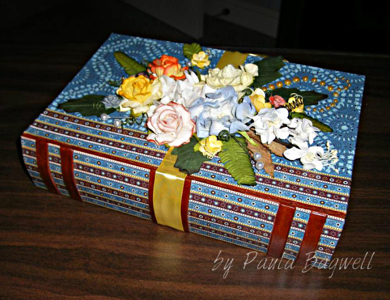
I decided to cover a paper mache "BOOK" box for Carol
and do the matching card with Tom in mind.


I've had this CTMH Sweet Home paper for some time now (it's retired). When I saw the paper mache book, I knew I had to cover it in this paper, because for some reason, the striped B&T patterned paper reminded me of story books my Grandmother had when we were growing up. Each book had 3 or 4 stories in them, and those stripes just brought back good memories for me :)

I attached the paper to the box with Mod Podge for Paper, letting each section dry thoroughly before moving on. It was pretty time-consuming to get all the pieces just right, because I had to line up the front cover's side binding with the back side (I'm OCD that way!!) and I went up and over all the edges with the papers. It probably would have been a whole lot easier
to just put the paper to the edges, and color the edges with matching markers!!!

When the paper was done, I covered the entire outside of the box, in stages, with a layer of the Paper Mod Podge... I like it better than the regular, because it's a lot less tacky when dry.

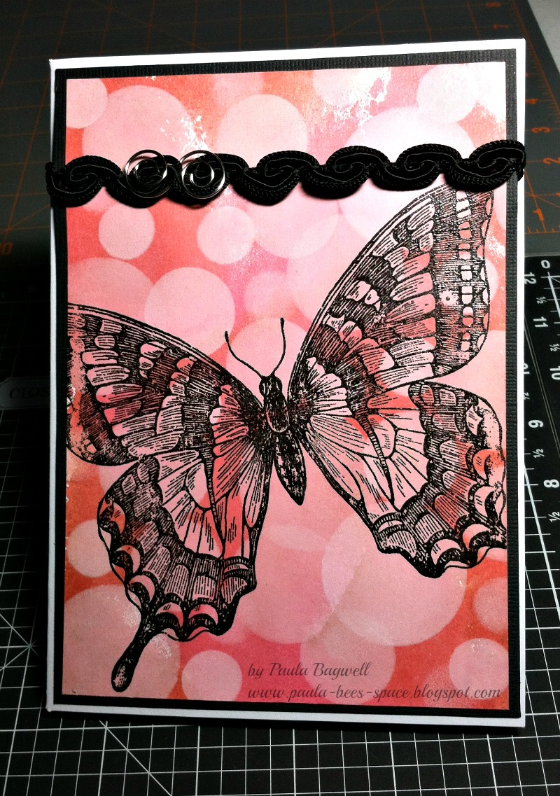
I thought the card turned out well. I got the idea for it on SCS... you can see it here. I found the train image online and printed it out with the sentiment,
in Indian Corn Blue (using RGB codes), above it. I inked all the edges of the pieces before glueing them together. I even inked, lightly over the sentiment, my own "steam" coming from the train stack, which helped give the illusion the train was in motion.

I made Carol a matching bookmark, and put everyting inside the book box, including the card, for them to open.  I added a "Discover" gift card for Tom, so he could use it for anything his heart desired, as long as the entity accepted Discover!

Here's some more photos of the project:


The spine I did with the striped paper. I cut all those pieces separate
because the "leather strips" were bumped up on the box.
All I did to make the 'leather' was color the bumps with several layers of the
CTMH Barn Red marker (old style), right on the paper mache.
It worked perfectly!


Carol loved this yellow B&T in this set, so I decided to do the inside with it.

If you look closely at the bookmark (or click to see bigger image),
you can see how I lined up the skinny blue strips with the yellow pattern.
That blue print was on the backside of the yellow in the kit.

The angle of this photo is off just a little, or you'd be able to see how the
striped 'binding" lines up from the front cover with the back cover... LOL!
And of course, I used I AM ROSES for all the flowers and leaves.
A few small ones I painted with the Lindy's Stamp Gang Magical Micas,
but most are the color they came!

Also, none of the photos show it, but it sure was a challenge to cover the curved inside binding edge at the top and bottom of the spine (you know how hard-covered books have the binding slightly curved out from the actual pages of a book.... well in going up and over those edges, the cut of the paper had to be arched... a straight cut line just didn't cut the mustard!

Whew! I'm glad it's done! But all in all, it was worth the time (and trouble)!
Hope ya'll like it, too. :)


Wednesday, October 24, 2012

Wedding Card

For my son's wedding, I made him and his new bride a card, of course!
I got the idea from a pin on Pinterest, and I think it turned out well.
Michelle's favorite color is pink, and her wedding colors were pink, yellow
and purple, so I made the card in those colors. I'm just glad they liked it!
But the photos came out a bit blurry... sorry :(


the front
(remember to click on any image to see it bigger)

The ribbon is actually keeping the card closed. I didn't want them to have
to untie and re-tie the bow, so it's a permanent bow with a magnet closure
underneath. It needed something to keep it closed, since it turned out so thick! See what I mean...


I even had to make a custom box for it....


This is the card open and standing (close-up photos are farther down):


and this is the back, both open and closed:


Here are some close-up shots of the front and back of the card:


As usual, I used a bunch of I Am Roses. All the colored
ones are painted with Lindy's Stamp Gang's Magical Mica's!
The white ones are the original colors as they came. 

Now these photos are from the inside of card.... first and second 'page'...


page 1 closeup

page 2 closeup


And then 'pages' 3 and 4....


page 3 closeup

page 4 closeup - (we tucked a check in the pocket behind the tag)

and the closeup of the tag:

I did the embedded-embossed technique on this tag, as well as
the hearts on page 1 and the hearts here on the back:


a closeup of hearts on the center back

Well, that's a lot of photos, and all of them were probably not necessary for this post, but I never know when to stop until I've run out of photos, LOL!! 

Thanks for stopping by.... have a great day! :)


Related Posts Plugin for WordPress, Blogger...