Sunday, October 28, 2012

Anniversary Card for my Hubby!

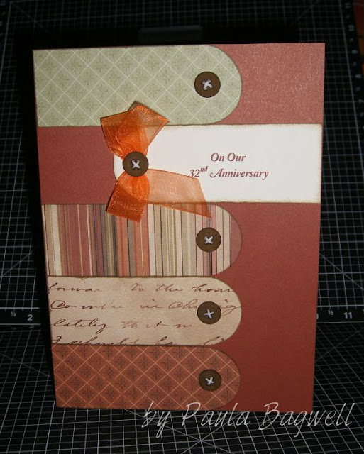
I made an card for my hubby for our 32nd Anniversary earlier this month.
I saw a card on Pinterest, made by Lisa House using CTMH That's Amore paper (retired). I loved the design and thought it would work well with
CTMH Passages paper (which I love and is also retired). I also made 
my card quite a bit wider than the one I saw here.

Here's my version:

My hubby liked it and loved the buttons!
(CTMH buttons with Colonial White Waxy Flax as the threads)

I used Barn Red cardstock for the base and made
the sentiment in MS Word using the RGB codes
I had to match the Barn Red color. Then I inked all
the edges of all the pieces in Desert Sand
before assembling them together on the card.


A peek inside:

I used the RGB codes to match Olive for the inside print, except
for a big "I Love You", which I kept in Barn Red.
Then I printed it all out on Colonial White cardstock,
and trimmed for the shapes I needed.

After inking the edges of the inside pieces,
I first matted the Colonial White on Olive cardstock
and then on the same striped B&T patterned
paper as the one piece on the front.
But with the camera angle, or maybe a tiny
movement when taking this photo, the stripes
came out a little funny looking in the photo!
Oh well, you get the idea! :)



Thursday, October 25, 2012

Stamp Swiping Technique

This video from CTMH features the swiping stamping technique. With stamp swiping, you can add texture, distressing, movement, and motion to your products. I want to try this technique!


Click HERE to watch on YouTube


Wednesday, October 24, 2012

Wedding Card

For my son's wedding, I made him and his new bride a card, of course!
I got the idea from a pin on Pinterest, and I think it turned out well.
Michelle's favorite color is pink, and her wedding colors were pink, yellow
and purple, so I made the card in those colors. I'm just glad they liked it!
But the photos came out a bit blurry... sorry :(


the front
(remember to click on any image to see it bigger)

The ribbon is actually keeping the card closed. I didn't want them to have
to untie and re-tie the bow, so it's a permanent bow with a magnet closure
underneath. It needed something to keep it closed, since it turned out so thick! See what I mean...


I even had to make a custom box for it....


This is the card open and standing (close-up photos are farther down):


and this is the back, both open and closed:


Here are some close-up shots of the front and back of the card:


As usual, I used a bunch of I Am Roses. All the colored
ones are painted with Lindy's Stamp Gang's Magical Mica's!
The white ones are the original colors as they came. 

Now these photos are from the inside of card.... first and second 'page'...


page 1 closeup

page 2 closeup


And then 'pages' 3 and 4....


page 3 closeup

page 4 closeup - (we tucked a check in the pocket behind the tag)

and the closeup of the tag:

I did the embedded-embossed technique on this tag, as well as
the hearts on page 1 and the hearts here on the back:


a closeup of hearts on the center back

Well, that's a lot of photos, and all of them were probably not necessary for this post, but I never know when to stop until I've run out of photos, LOL!! 

Thanks for stopping by.... have a great day! :)


Related Posts Plugin for WordPress, Blogger...